Core: Prioritising eligibility over persuasion in consumer lending
Mobile App
Loans
Fintech
Role: Lead Product Designer
Designing a consumer fintech app that helps users understand loan eligibility before committing.
Pre-launch (pending store approval)


TL;DR
- Designed consumer lending flows for first-time borrowers
- Prioritised eligibility clarity over rejection-based flows
- Reduced fear and confusion around borrowing
Context & Problem Space
Core is a Nigerian consumer fintech app offering instant loans, wallet services, and bill payments. Many users are first-time borrowers with limited financial literacy and low tolerance for confusion.
In early conversations and internal reviews, one pattern was clear: users often felt anxious or misled by lending apps that asked them to apply first, only to reject them later.
This created frustration, mistrust, and drop-offs.
The problem wasn’t access to loans — it was how expectations were set.
My role
I worked as the Lead Product Designer, responsible for the end-to-end mobile experience across loans, wallet, and bill payments.
My responsibility included interaction design, system-level UX decisions, state handling, and UX writing — with a strong focus on clarity and trust.
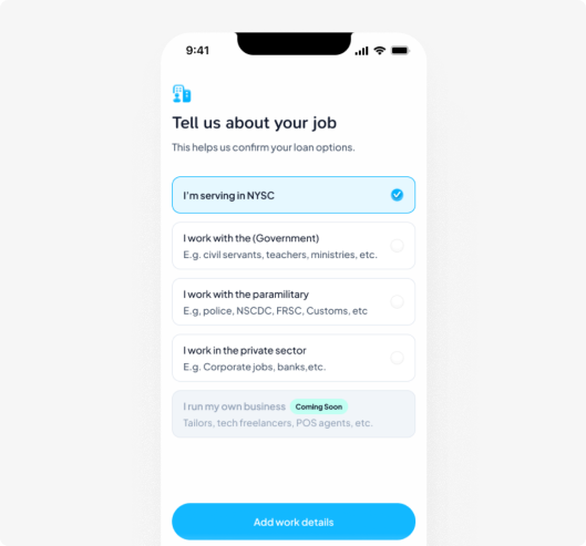
SELECTING JOB TYPE
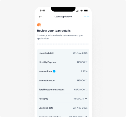
LOAN DETAILS AFTER ELIGIBILITY
Key Design Decision: Eligibility Before Intent
Most lending apps follow this pattern: Apply → Wait → Get approved or rejected For many users, rejection felt sudden and unexplained. I proposed reversing this flow. Instead of asking users to apply first, Core surfaces eligibility upfront, helping users understand what they qualify for before committing emotionally or financially. This shifted the experience from judgment to guidance.
Designing the Eligibility Flow
Eligibility was treated as a system, not a single screen.
The flow was designed to:
- show users where they stand early
- explain outcomes in simple, non-intimidating language
- provide clear next steps instead of dead ends
Key states included:
- eligible
- partially eligible
- ineligible
- pending verification
- retry or improve eligibility
Each state was intentionally designed to reduce anxiety and prevent confusion.
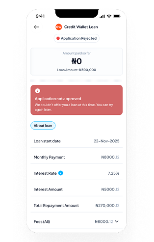
APPLICATION NOT APPROVED
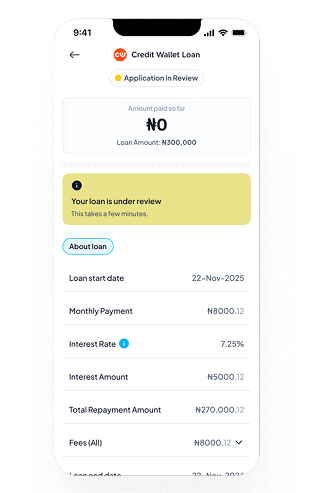
UNDER REVIEW
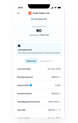
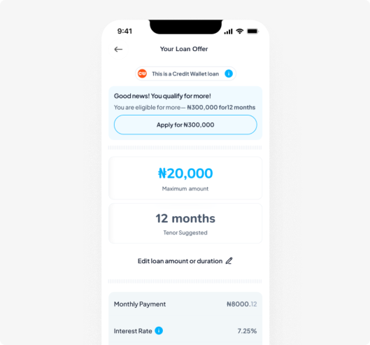
LOAN APPROVED
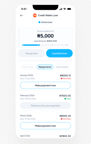
Designing for States, Not Happy Paths
Because lending is rarely linear, I designed explicit states across:
- loan application
- repayments
- wallet funding
- transaction failures
Users are always told:
- what is happening
- why it’s happening
- what to do next
This reduced ambiguity and potential support issues.
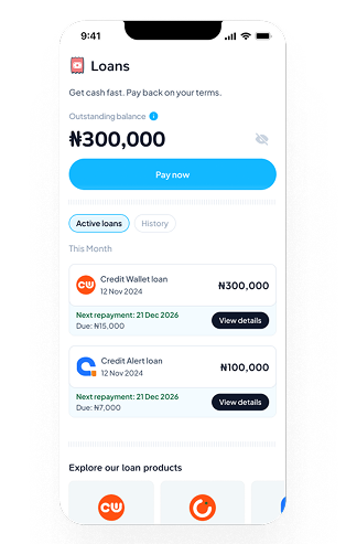
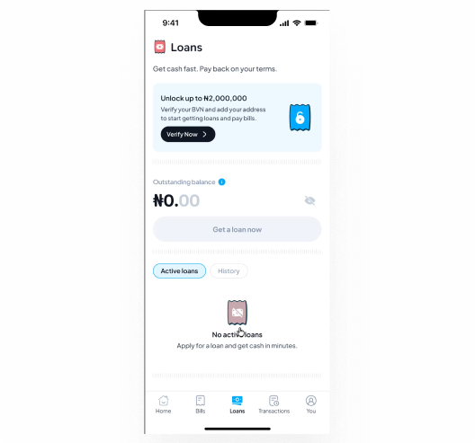
ACTIVE LOANS
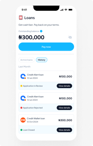
LOAN HISTORY
REPAYMENT HISTORY
Defensive UX & Language Choices
Financial products can easily intimidate users.
To reduce misinterpretation, I:
- avoided traditional “credit score” framing
- used helper text and info modals to explain decisions
- clarified what metrics meant — and what they did not mean
- wrote UX copy in simple, mobile-friendly language
These guardrails were designed to protect users and the business from misunderstanding.
Outcome & Current Status
- End-to-end mobile experience designed across loans, wallet, and bill payments
- Eligibility-first lending model established as the foundation of the product
- App currently pending store approval
Post-launch iterations will focus on refining eligibility messaging and recovery paths.
What This Project Reinforced
- Eligibility clarity builds trust faster than persuasion
- Designing for states matters more than polishing happy paths
- Defensive UX is essential in low-trust environments
What This Project Reinforced
- Surfacing eligibility early reduces emotional drop-off:
Users respond better when expectations are set before commitment, especially in high-anxiety financial flows.
- Defensive UX is not optional in consumer fintech:
Clear framing, helper text, and explicit states prevent long-term mistrust and support issues.
- Designing states matters more than designing screens:
Real users encounter pending, failure, and retry states
- Language shapes trust as much as layout:
Removing intimidating financial terminology made outcomes easier to accept and act on.